|
You Look Marvelous
(How to Build Your Business with Photographs)
Do you have a great business photograph of yourself? If you don't, you're
sabotaging your marketing efforts. No matter what you do for a living, you need
to project a professional image as a trusted advisor. If you're not viewed as an
advisor, you're just another vendor, service provider, corporate drone,
salesperson, etc. Your photo is your avatar, a stand-in for you when you can't
be there in person. But other kinds of photos are equally important: quality
photos of your product, facility, service area, and customers can be powerful
selling tools.
Almost any ad or marketing piece can be improved by including a photograph…
provided it's the right kind of photo! Unfortunately, the reverse is also true.
Using the wrong photograph can ruin an otherwise good piece. Here are examples of good photos you can use in your brochures, ads,
newsletters, web site, internal communication pieces, etc. (By the way, I'll
often use the short-hand term "ad" to refer to all of these vehicles.)
 |
1. Portrait
If you don't already have one, you should definitely invest in a really good
portrait photograph of yourself. Find a local portrait photographer and work
with him or her to produce a photo that'll help build your business (you'll have
many other uses for the photo besides the ad).
You DO NOT want to use a $12 passport photo shot with a Polaroid! A good
professional portrait will cost at least $200 and probably a lot more. However,
it's money well spent.
Even if you don't consider yourself all that photogenic, a skillful photographer will
know how to make you look good on film. Block off enough time for the shoot so
you won't feel rushed or stressed. Get a good haircut a few days before (but for
men, not the same day) and get a good night's sleep prior to your session. |
Here are the Essential Elements of a Great Photo Portrait:
-
A natural (not forced) smile. Think about something that gives you great
pleasure (the sound of your child's laugh, a cat purring in your lap, etc.) or
about something funny that happened recently. Don't try to consciously move the
muscles around your mouth to smile; it'll look forced. Get in the right frame of
mind and you'll automatically get the right smile.
-
Eyes looking right at the camera. Nothing else is acceptable.
-
Not overdressed or underdressed. Use your good judgment. Dress the way a
customer would see you when they walk into your office or store. If you work
with your hands, then it's certainly fine (and can even be a big plus) to wear a
shop apron. Just make sure whatever you're wearing is clean and neatly pressed.
-
Simple, uncluttered background. A neutral gray background is always
acceptable. Just make sure the background doesn't make it look like your
yearbook photo. A moderate gradient is OK, but don't go for the vignette look;
it's dated.
-
No distracting reflections in glasses, etc. If you wear glasses, keep them
on for the portrait. Just make sure the photographer lights you to avoid
reflections, which can ruin an otherwise perfect photo.
|
|
| |
You want the photo to make this statement to the viewer: "Here is somebody you'll like.
Somebody you can trust. Somebody who'll treat you with respect." That's who
people want to work with and buy from. |
 |
2. Group Photo
If you're a husband and wife team, or you have partners, then by all means,
do a couple or group shot. Just remember: many more photos will need to be taken
in order to get the one where everybody looks good at the same time.
As you can see from the example, you have a little more posing
flexibility with a couple or team photo. Whereas, a solo portrait should almost always
be a head and shoulders shot, you should pull back more on a group shot.
Not everybody has to have exactly the same expression. From the example, you can see there's a bit of contrast in their expressions. She's smiling
about as much as is humanly possible (and looks adorable), while he has more of
a reserved smile. This is fine.
Some people don't want to use their portrait in an advertisement. They're
concerned about security/privacy, don't think they're good looking enough, don't want to
hassle with the portrait sitting, etc. I feel this is a mistake. One of the main
barriers people have to doing business with you for the first time is not
trusting you. A friendly, welcoming photo of you will go a long way toward
breaking down that barrier. |
| |
But… if you still don't want to run a photo of yourself, there are other
options. None of them will be a good as the portrait, but here they are: |
 |
3. Customers Shopping
If you are in retail or "semi-retail" (meaning no storefront but with a similar
buying dynamic), then you can show happy customers buying from you. If you can
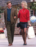
get a photo like this one, it can be a very positive element in your marcomm. I
prefer featuring people rather than product in photographs. Displaying the pleased
expressions on buyers' faces is much more important than showing what they're
looking at. Another important fact: people like to look at people, particularly
happy, attractive people. It's universally appealing. Just scan your local
newsstand. Look at all the magazines. What do 90% of them have on their covers?
People. Nuff said.
The example photo could be greatly improved by "knocking-out" the background, leaving
white space around the couple. (This almost always improves a photo of this type,
particularly when there's a busy background image.) You want the focus to be on
the people. A program like Adobe PhotoShop™ can create "image masks,"
or you can send it out to a service bureau to have it inexpensively done.
In a non-retail environment (consulting or professional services for
example), You don't have the same kind of "buying" behavior to photograph.
Nonetheless, "shopping" photos can still be effective. Unfortunately, these all
too often are of the generic "people sitting at a conference room table" type.
Avoid the temptation to use stock photos. Much better to go onsite and take
photos in your customer's natural habitat. |
 |
4. Storefront or Office
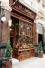
You can run a photo of your storefront, provided it is attractive and your
store name is clearly visible, as in the example. However, if you're in a
strip mall or urban environment, with lots of decals stuck on your windows,
etc., you may want to think twice about using a photo of your storefront. Take a
fresh look at your store or office (it's a very good idea to do this anyway). You come and
go every day, and over time, tend to get used to peeling paint, worn mats,
corroded door hardware, etc. Be sure you're making a positive first impression,
photo or no photo. Unless you have a really distinctive interior, I'd advise
against a general inside photograph. Unfortunately, many stores within the same
retail niche look pretty much alike inside, and what you're trying to do in this
ad is differentiate yourself from your competition.
If you're office-based, the same general rules apply. If your building is
distinct or prestigious or has some compelling attribute, by all means, feature
it. Particularly if you're a service-provider, it's important to "tangibilize"
your offerings. An office photo may not relate to anything you *do* but can
still serve an important role in establishing that you're a "real" business. |
 |
5. Product Shot
If you manufacture or sell products, then of course, you'll want to feature
them. Or maybe not… Here are the pros and cons of product photos. On the pro
side, these photos can be very iconic, and call out to the people who may be
looking for that kind of item. Most men are "thing-oriented" and therefore very
responsive to a compelling product shot. Women, in general, are more
relationship-oriented and more responsive to photos of people than things (it's
extremely rare for a female-focused magazine to not feature a person on the
cover).
On the con side, a photo can be limiting, for several reasons. If you have a
very broad product line or service offering, showing just one (or a few) can
telegraph the message, "This is all we do." If you're in the arts or have an
aesthetic retail operation like jewelry or gifts, focusing on the "wrong" item
can be disastrous. People's tastes vary tremendously. What looks great to one
person may be unappealing to another. You may pick an item that you just love,
but somebody else may look at it and say to themselves, "Ugh. They only have
ugly stuff there."
Nonetheless, if you want to use product photos, make sure they are of very
high quality, with sharp focus, good contrast, and neutral backgrounds. This
almost always means hiring a pro, or investing in the right cameras, lenses,
lighting equipment *and* training.
|
 |
6. Customer Service
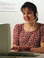
If you're selling products or services via phone, mail, or web, a "real live
human being photo" is a must. Even though headset pictures like this have almost
become cliché, you still need one. If you have a choice of using a man or a
woman in the picture, use a woman. I don't mean to sound sexist, but you will
get fewer orders from the man picture. Why is that? It's because a man in this
context is viewed as a salesperson whereas a woman is viewed as an
information-provider and order-taker. People don't want to be "sold." They want
their questions answered, their fears allayed, and their order processed
efficiently. Sorry guys, but you're the pushy salesman. Get a friendly lady to
pose for your customer service photo. Run it right by the 800 number, and on
your catalog or printed order form, and by the shopping cart button on your web
page.
|
 |
7. Clip Art
Some people use clip art in their ads. Please try to avoid this. Most clip art
is hideous (especially the free stuff on the web). There's no excuse for using cheesy clip art – it screams small time
operator. If you insist on using clip art, please make sure it's got some
style, like the example below... although you should note that a photograph is
almost always better than even a really good rendering.

|
Photo Captions
Every photo must have a caption. When somebody scans your ad for the first
time, their "eye path" usually starts at the photo, drops down to the caption,
then moves to the headline. A caption is one of the most read parts of your
advertisement. So, what should yours say? If you're running a solo portrait photo, then the caption should read like
this:

Ralph Malph
Anytown's Friendliest Insurance Agent
Notice it's set in a different font (in this case italic Tahoma), with
the name bolded. I like the idea of tagging a short phrase below the name. In
this case it's "Anytown's Friendliest Insurance Agent." You can do all sorts of variations on this theme. For example, for
Christmastime ads, you could become "Anytown's Merriest Insurance Agent." Another caption that works well is a credentializing statement like "Certified Financial Planner" (not "CFP" — few people will know what your
acronym means).
If it's a group photo, you have several caption options. For 2 or 3 people, you
can still list names, and then tag them with a statement like "37 Years of
Experience" (reflecting the total for everyone). If there are more than 3 people
in the photo (which I don't recommend to begin with), you can't list all the
names. In that case, use a caption like "The XYZ Experts at [Your Business
Name]."
For a customer photo, try something like this:

Select from the Largest Collection of
Designer Clothing in the Tri-City Area
The important thing here is to present benefit-oriented statement. Don't just
caption it like one of your vacation photos with an obvious statement like "Customers Shopping
at West Gomorrah Mall."
For the storefront photo, you could say "Anytown's Best Loved XYZ Store" or "The Source for Fabulous XYZ." You have quite a bit of flexibility with captions. Use these as
idea-stimulators. Have fun with this!
Photo Formats
It's a digital world. You almost certainly want to get your photographs in
digital format. Unfortunately, a few pro photographers still haven't
transitioned over to digital, and many don't like to give up control
over "their" photographs. If you're hiring a pro, make sure your contract
provides you with all rights to the "work done for hire."
When you've got a great photo, it's very likely you're going to use it a lot.
With any luck, your portrait will appear in your community newspaper, industry
trade journal, business magazine, etc. You'll want to use your facility photos
in a variety of media. Your product shots can often have a long shelf life.
Therefore, it's in your interest to obtain very high resolution digital files,
whether digital originals or high-res, color-corrected service-bureau scans.
Once you have high quality digital files, it's a simple matter to downsample
them for web use, create black and white headshots for the newspaper, and so
forth.
Beyond Stills
The step beyond static photographs is video production – and it can be a
giant step. The web has finally become a viable distribution medium for business
video, and there are *enormous* possibilities for you to tell your story with
power and clarity unobtainable otherwise. I'm thinking of doing a future article
on business video. If that's something you'd be interested in learning more
about, please write to me and say so. I love to hear from Urbach Letter readers,
so don't be shy.

|
Return to Archive
|


