|
|
||||||||||
|
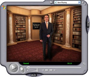
How to Get People to Read Your Stuff You could be the smartest person in town. However, if your physical appearance more closely resembles Alfred E. Newman than Albert A. Einstein, not very many people will be able to get past their initial negative impression of you… and listen to the smart things you have to say. You could have enormous wisdom to share, but if your verbal ability is lacking, few people who could benefit from what you have to say will endure your poor delivery… and actually listen to your advice. Likewise, you could be a fantastic writer, with great ideas, insight, and experience to convey. You could type 70 words a minute, and create volumes of important work. But… if you don't take the additional step of improving the *appearance* of your written communications, your ability to actually achieve your personal and professional goals will be severely impaired. In the worst case, the hard, hard work of writing will be entirely wasted. I don't want that horrible fate to befall you my friend. Writing good stuff is hard enough. Why handicap it with a boring, hard to read presentation? My strong advice to you: invest a little time now to learn some tips and tricks that'll *supercharge* all your emails, letters, memos, and other written communications. While it seems incongruous, I'm NOT going to show you those tips and tricks with words on this page. Instead, I invite you to click through to this fast-moving multimedia video magazine episode: (Please click once and wait for the video to start streaming on your computer) Problems, Questions? A technical note: I'm always pushing the technical envelope with the Urbach Letter video. Last month, I bumped up the size and quality of the video image. As a result, some people with less-than-wonderful Internet connections had trouble tuning in. Things should be a lot better this month (geek note: I've started encoding for multi-bitrate streams). You'll still need broadband. If you're on a dial-up connection, forget it. But if you have DSL, cable, or an office network connection, you should be good to go. If you need some help with technical problems, please click here. Test Your Knowledge Take this little test: Question #1: Is it OK for a modern business letter to use a monospaced font? Question #2: What does the new correspondence style mirror? Question #3: Single or double space after periods and colons? Question #4: What font sizes are preferred for main body text in letters and reports? Question #5: What will happen if it's smaller than recommended? Question #6: Which form of justification causes word spacing problems? Question #7: What are "white rivers?" Question #8: Is a dash different than a hyphen? Question #9: What should you use instead of a double-hyphen? Question #10: How wide is an Em-dash? Question #11: How is an apostrophe different than a prime? Question #12: How do you "uncurl" a quotation mark? Question #13: When do you underline? Question #14: Should you use bold to emphasize words in a letter? Question #15: What is the best way to emphasize body text? Question #16: What does ALL CAPS imply? Question #17: What is the most important element in graphic design? Question #18: Name the three most important kinds of contrast. Question #19: Which is strongest? Question #20: Name two other kinds of contrast Answer Key 1: Not really; 2: Typeset; 3: Single; 4: 10, 11, or 12; 5: Eye-tracking problems; 6: Justified; 7: Word gaps; 8: Yes; 9: Em-dash; 10: m; 11:It's curly; 12: Alt-Backspace; 13: Almost never; 14: No; 15: Italics; 16: SHOUTING; 17: Contrast; 18: Weight, Scale, Form; 19: Weight; 20: Scale, Placement. So… how'd you do? Give yourself one point for every correct answer.
|

